There’s a quiet language embedded in every digital experience. No, not code, something more subtle. Symbols. Shapes. Tiny visual cues that guide decisions faster than words ever could. Think about it: how often does a user pause to read instructions versus simply following a familiar signpost?
Table of Contents
ToggleDigital environments are increasingly shaped by split-second judgments. According to research from Google’s UX team, users form an opinion about a website in under 50 milliseconds. That’s less time than it takes to blink. So what fills that gap between arrival and action? Visual shorthand, carefully designed elements that signal meaning instantly. And this is where design stops being decoration and starts becoming behavior architecture.
Patterns stick because they had to – our ancestors survived by noticing them fast. These days, the same instinct decides if a person stays online or leaves right away. When faced with new screens, eyes lead before words get a chance. Research last year showed people follow what they see far more often than what they read. Eight times out of ten, visuals win. Makes sense, really. Reading requires effort; recognition doesn’t.
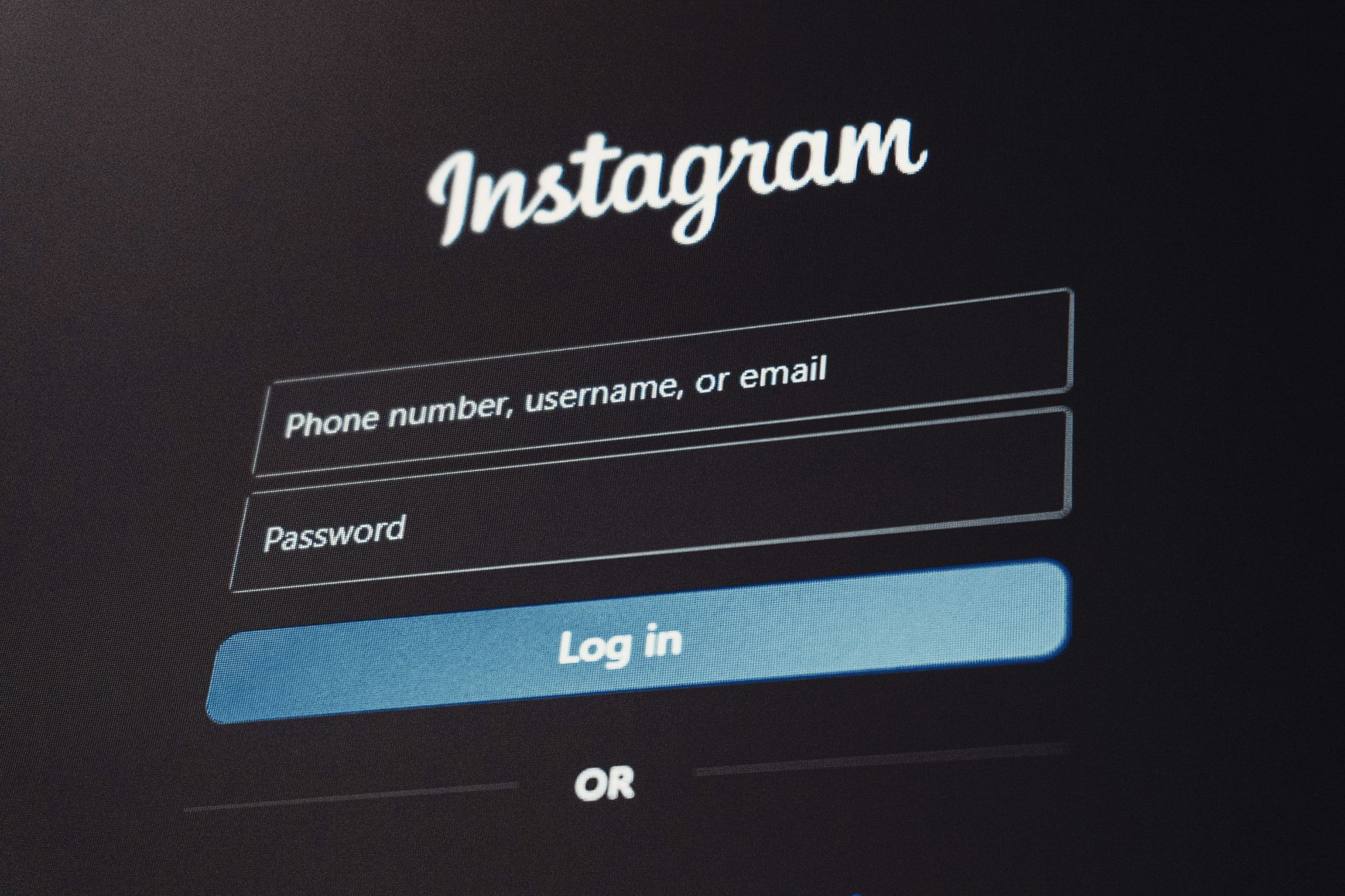
Here’s the key distinction: recognition is effortless, recall is work. Interfaces that lean on recognition reduce cognitive load, and users reward that with engagement. Consider authentication flows. When users encounter familiar visual markers, like widely recognized brand symbols, they don’t just recognize them; they trust them. It’s almost reflexive. A login screen featuring a known ecosystem symbol feels safer than one that requires interpretation. True, that trust isn’t always rational. But it’s powerful.
There’s something oddly comforting about consistency across platforms. The same shapes, colors, and visual structures appear again and again, and users come to depend on them. A study by Baymard Institute revealed that nearly 60% of users abandon checkout flows if they feel uncertain about security or legitimacy. Not because something is wrong, necessarily, but because something feels off. Let’s put it this way: when authentication systems integrate recognizable elements, say, a well-known brand symbol, it reduces hesitation. The presence of a familiar icon acts almost like a digital handshake.
This isn’t accidental. Major ecosystems invest heavily in maintaining visual consistency across apps, devices, and services. The result? A kind of universal design dialect that users instinctively understand. And yes, sometimes that tiny symbol carries more weight than a paragraph of reassurance text.
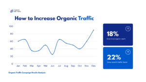
Website Traffic behavior isn’t just about where users go, it’s about how they move. The difference between a click and a scroll, a pause and an exit, often comes down to micro interactions. These are the small, almost invisible design moments:
Individually, they seem minor. Collectively, they shape entire user journeys. The economics of small decisions. Here’s an unusual statistic: Amazon once reported that a 100-millisecond delay in page load time cost them 1% in sales. Now imagine the impact of hesitation caused by unclear design elements. Micro interactions reduce friction. Less friction means faster decisions. Faster decisions mean more conversions. Exactly.
Of course, not all web design helps. In fact, poor visual decisions can quietly sabotage even the most sophisticated platforms. Users are surprisingly sensitive to inconsistency. A misaligned button, an unfamiliar symbol, or an unexpected color scheme can trigger doubt.
Come to think of it, these issues often go unnoticed during development, but users feel them immediately. And when they do, they hesitate. Or worse, they leave.
Surfaces shift while you watch. Watch closely – screens learn motions, react quicker, reshape themselves quietly around what feels familiar. Machines tweak colors, sizes, and shapes after watching how fingers move again and again. Habits leave traces; software notices, adjusts, and brings forward what matters most often. What comes next won’t stay frozen in place. Instead, interfaces could dynamically adjust based on context:
It sounds futuristic, but parts of this are already happening. Still, one thing remains constant: users gravitate toward what they recognize.
Most online worlds move quickly, run on numbers, and shift without stopping. That part checks out. Yet inside all that rush sit things you might not expect: gut feelings, awareness, belief. People who design screens aren’t only building layouts – they guide actions. Each color picked, each tiny animation seen, each mark placed pushes someone a little closer to doing something.
And while technology keeps advancing, the fundamentals haven’t changed all that much—especially in web design. People still look for familiarity. They still respond to patterns. They still trust what feels known. So the next time a user clicks without thinking, pauses without knowing why, or chooses one path over another, it’s worth asking: was it really a decision? Or was it design—and the subtle influence of web design and SEO—doing its quiet, persuasive work?